Ranking the 2026 F1 liveries from worst to best - a designer's verdict
We've now seen all the 2026 Formula 1 liveries in the flesh across Barcelona and Bahrain.
So we asked The Race's Creative Lead, Oliver Card, to cast his expert eye over the 11 liveries once more (having ranked the first seven after Barcelona) and rank them from 'worst' to best.
We say 'worst' because, in Card's view, this is the toughest ranking he's done due to it being a really solid year for livery design - partly aided by F1's new livery rules, where teams now have to paint more of their car.
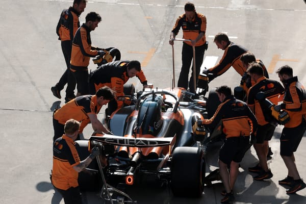
11 McLaren: The return of the orange segments
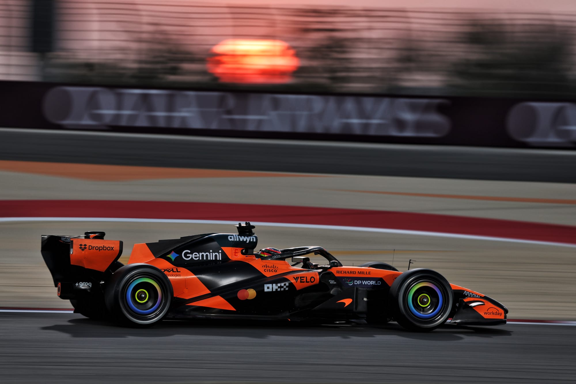
Taking a leaf out of Red Bull's recent rulebook, reigning constructors' champion McLaren has retained a very similar design with minor refinements, but it still strikes as a livery that tends to look great from some angles (a perfect side-on profile where you read the continuity of the lines across the car) and disjointed from others. It seems to be a design concept stuck in its weight-loss era, with each of the orange panels still appearing overly broken up.
There is an improvement with an increase in the signature McLaren orange now wrapping around the cockpit, which floods more papaya on the front view and creates a more defined central black 'tiger' stripe across the car, but I just want to connect all the other separate elements together and wrap the design around the elegance of the bodywork properly.
Mastercard is a gift of a title partner sponsor for McLaren as their brand colours are highly complementary. I was expecting a more Mastercard-led approach, so it surprised me how hidden the logos seem to be on the car, and how it has less prominence than Google's Gemini brand, whose AI palette now features on the wheels, replacing the primary Chrome tones in 2025. I was more excited by McLaren's special liveries in 2025, so I'm looking forward to what they may have in store for this season.
10 Alpine: Effort placed elsewhere
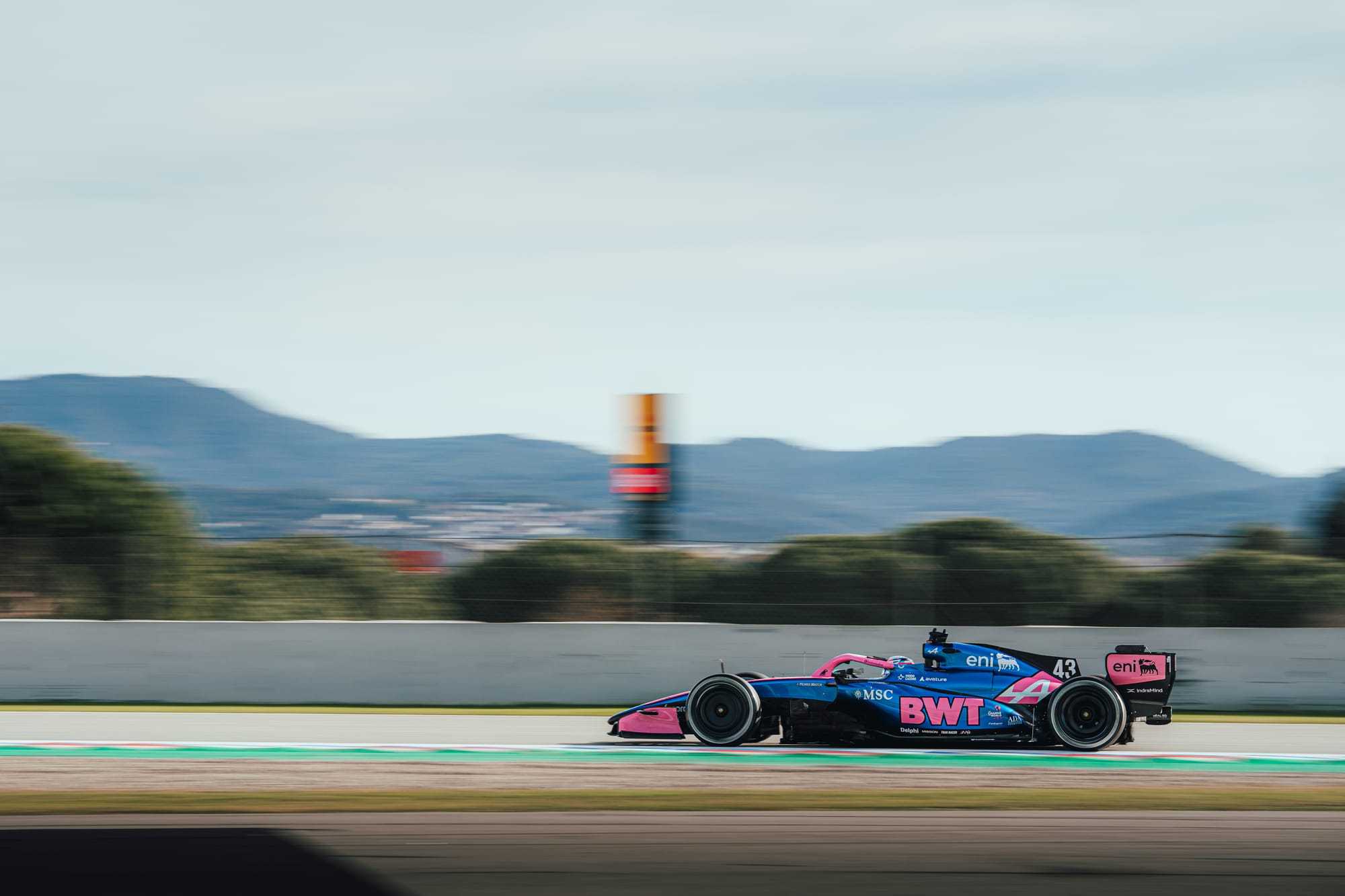
This was my top livery for 2025 and this is a mostly copy+paste job for this year. Absolutely fine from a design perspective, it isn't an issue to have visual continuity (see Red Bull Racing years 2016 - 2025), however it does feel odd not to build on last year's eye-catching design as we enter a new era of F1.
The good news for Alpine is that last year's concept translates very well on its 2026 car, so with some minor dialling of accents here and there it still works. The bubblegum pink still pops and the glossy Alpine blue is still dynamic.
Considering the results from last year, you would think the team might want to shake things up a bit so it doesn't bring back memories of an underwhelming season, but perhaps the wider message is "we're focussing our energy elsewhere". As the old adage goes, if you stand still, you go backwards and its lower ranking is reflective more so of other teams making big improvements rather than this being in any way a poor livery.
9 Aston Martin: Unradical but moving forward
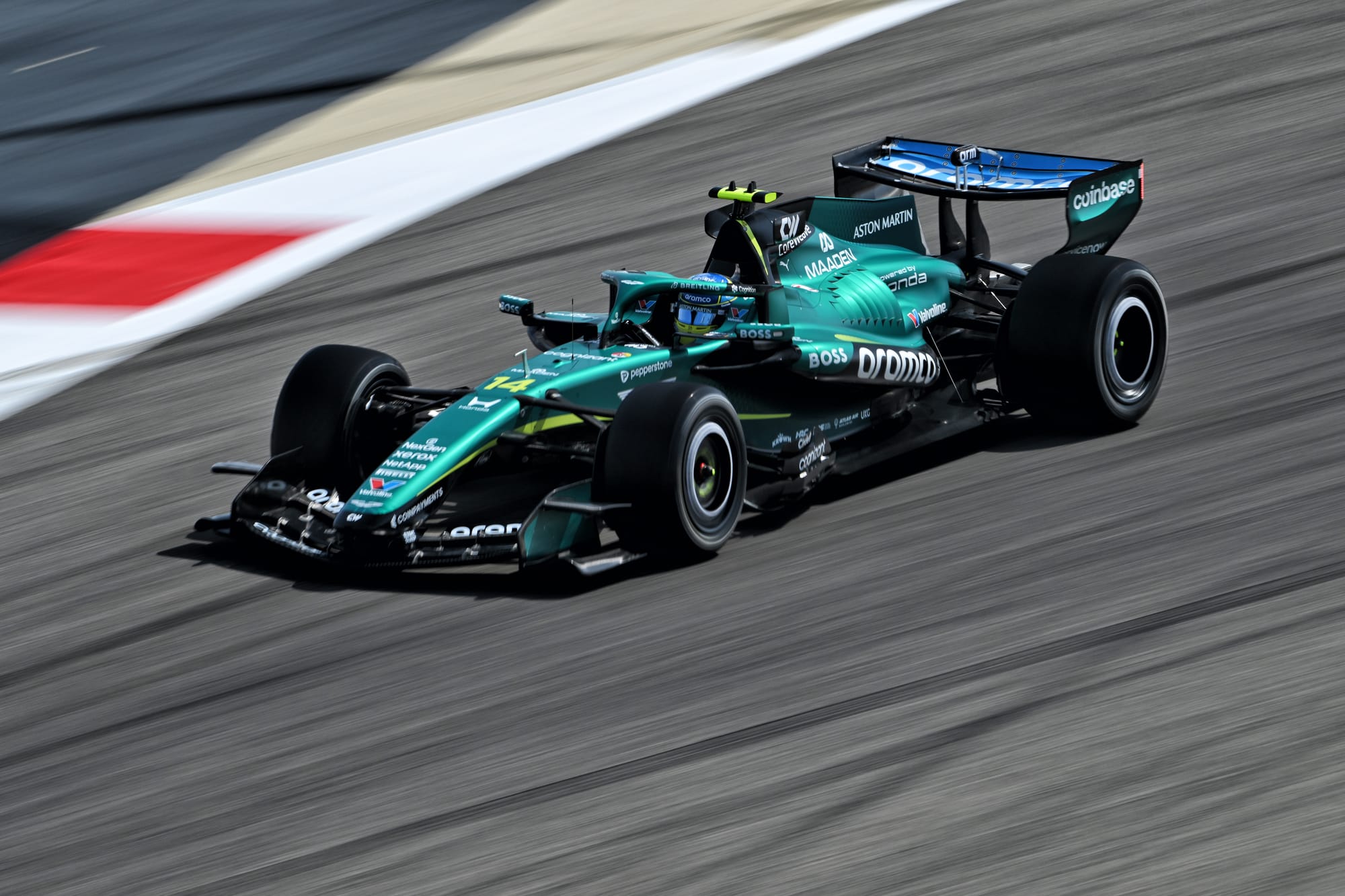
While most of Aston Martin's radical innovation will come from its physical design rather than its livery, there is a satisfying, if conservative, evolution for 2026.
Slowly but surely, Aston Martin is taking steps forward to better embrace the Aston Martin Racing visual DNA through its dual-tone scheme, with the addition of more of the neon accent beyond stripes onto the tops of the sidepods using a more eye-catching dot gradient spilling towards the end of the car.
Further back, the new shark fin features a subtle pseudo-fishscale that grades the lighter green into a darker tone. This feels more appropriate for a marque such as Aston Martin, where consideration of craftsmanship and high-end detailing is really key to portraying the value of the end product.
In terms of its sponsor and partner integration, there has been a trend in recent years for "brand flaps" that use the colour accent to create creep over the bodywork on smaller segments (see Boss on the sidepods). These serve a purpose to make the brands stand out, but lack the elegance of the horizontal lines elsewhere. As engine partner, Honda's presence is somewhat understated with its latest wordmark iteration, which lacks the punch of the more traditional serif logo.
Radical this is not, but there are improvements that subtly bring more texture to the car, while keeping in line with a brand wanting to project an image of ultra-luxury performance.
8 Williams: Corporate but confident blues
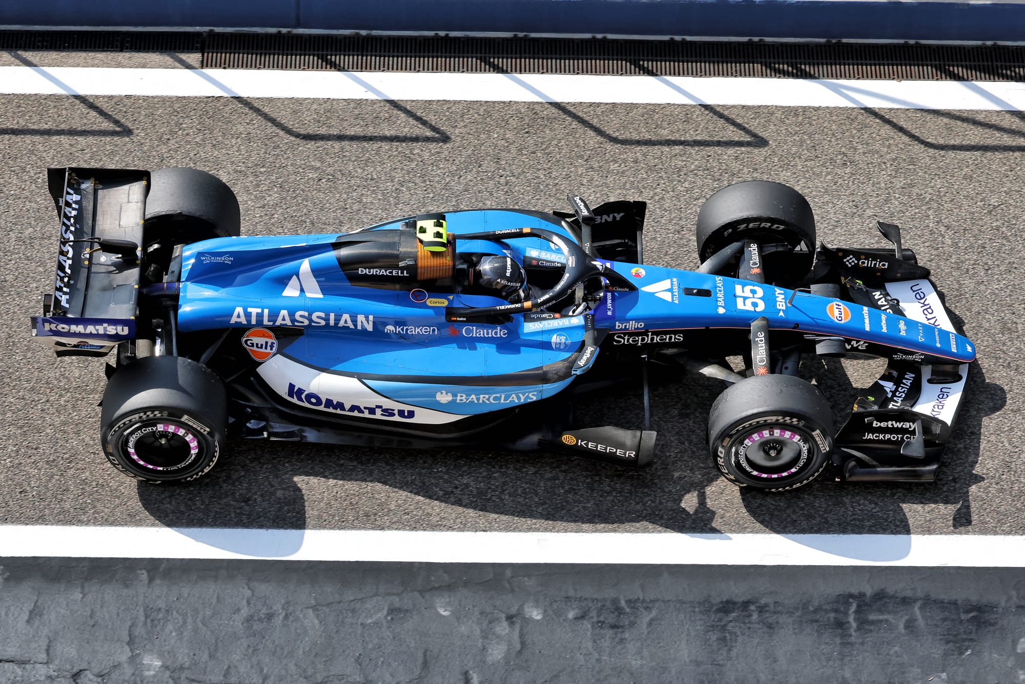
Williams has had a rollercoaster with livery designs since 2019 but has found its groove in recent years with a corporate-friendly approach that has now attracted a large number of sponsors. Flicking back through the barren liveries of 2021-23 where sponsors seemed largely absent, the large, bold brands now covering the car must be heartening for the Grove outfit.
The sponsors themselves should be delighted as well with how little they've had to compromise to get their brand colours onto the car. The dominant colour is now title partner Atlassian's cobalt (much closer to Alpine), rendered as more of a bright single colour block than the softer gradients of recent years. Komatsu's darker blue wordmark is now flipped to a white background to create less of a clash with Atlassian, with a white section that clips from the body to the rear wing leaving a prime spot for yet another partner to join the party.
New for 2026 is the addition of Barclays, bringing yet another shade of blue to the car, with its vivid cerulean tone that bears a resemblance to the Williams's logo accent that has quietly been dropped in recent years in favour of Atlassian alignment. It's a lot to contend with, and I think breaking the colour blocks up with black isn't complementing the mix of blues; I'd be more in favour of going straight from Barclays blue to white so you aren't contending with yet another element.
My initial instinct when the launch renders were unveiled was that it was too business-like, a little "LinkedIn on wheels", and lacked Williams DNA in favour of sponsor appeasement. But on track the car reads well and the blue punches out. Elsewhere, the much celebrated Duracell air intake is still impactful and the pencil thin white and red stripes remain a sophisticated finish.
7 Cadillac: Eye-catching asymmetry but lacking an accent
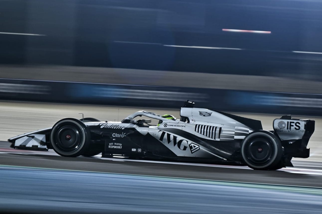
Tapping into both American landmarks and landmark events, the newest team on the grid revealed its livery simultaneously at Times Square and during Super Bowl coverage, unveiling a dynamic asymmetrical design that at first glance conjured memories of the late-90s/early-00s West McLaren Mercedes, a heart-string-plucking trip down nostalgia lane.
What set off the McLaren was the punchy red accents' minor flourishes throughout and what's maybe missing from Cadillac is a strong accent that cuts through the monochrome concept that often reads more like a porcelain white than chrome. Cadillac has in its identity yellow, blue and red as brand colours. Of these, bringing yellow back onto the grid would have been my preferred approach: with Renault gone, yellow is waiting to be seized upon by a team wanting to set itself out from the silvers and blues that are dominating this year.
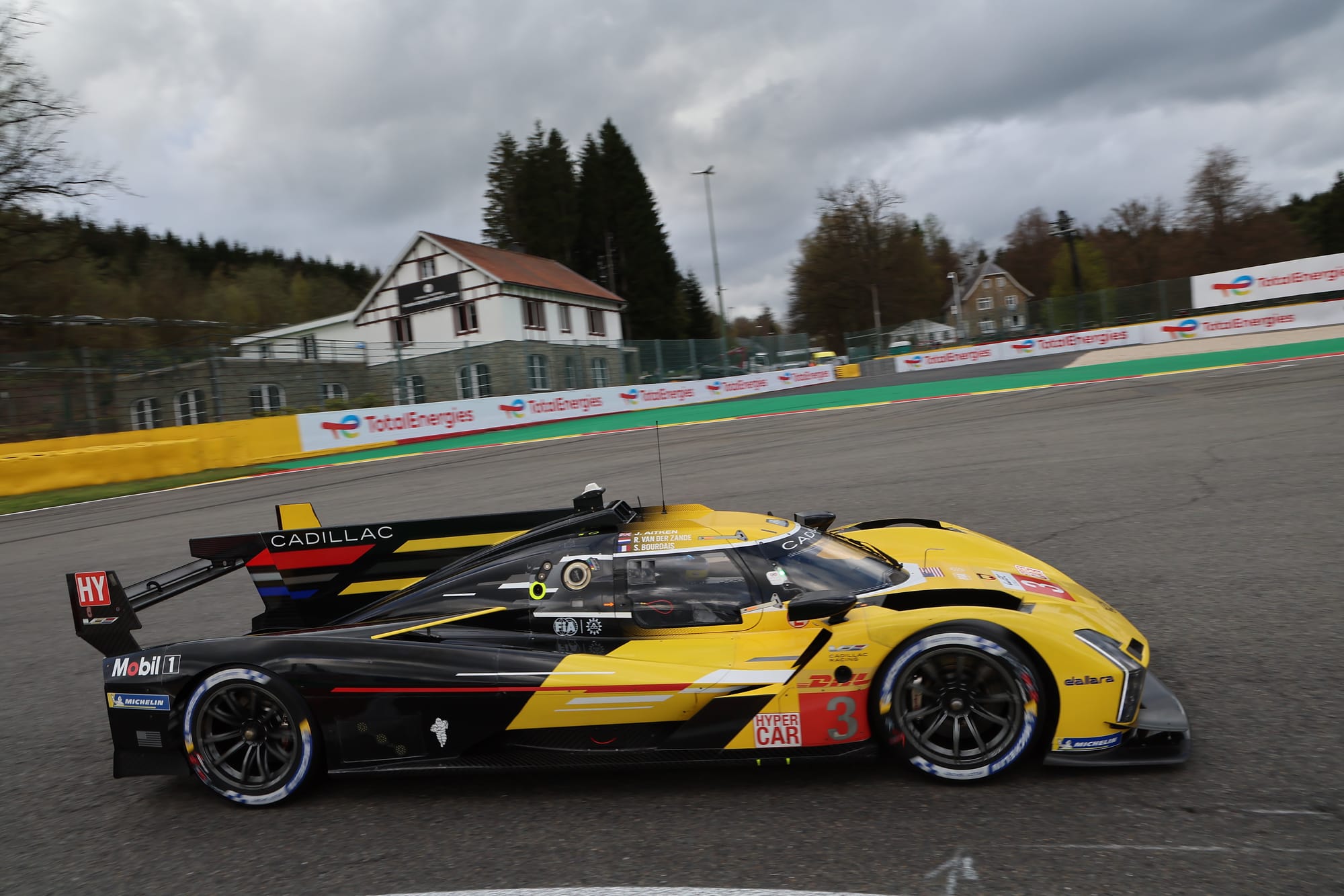
The #3 2023 Cadillac LMDh (above) was a fine example of this, however, the mission of F1's 11th team mirrors Audi's as they both look to attract partners to the project.
Before those sponsors arrive, we can enjoy the expansive reinterpretation of its marque that looks brilliant splashed across the back of the engine cover. Their approach reminds me of Alfa Romeo's presence on the Sauber (circa 2018-23); cleverly extracting existing brand elements while dipping into heritage aspects (the elegant Cadillac script typography is stunning) that speak of a brand with depth in its history but redefining itself for its F1 era.
6 Red Bull: Stunning design compromised in real-world conditions
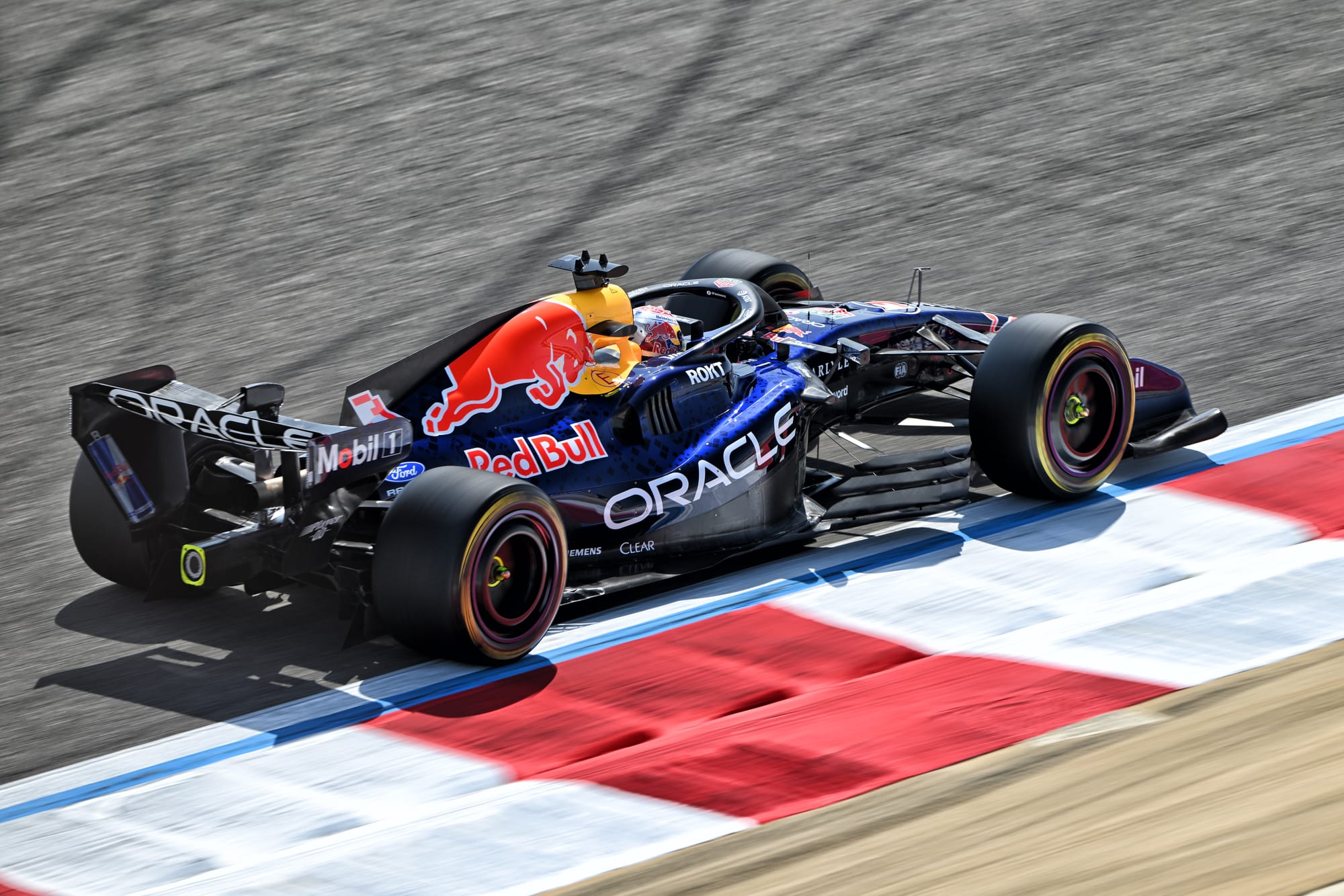
Be still my beating heart (or maybe that's just the energy drink talking); after the best part of a decade, Red Bull's livery has finally had an overhaul!
The launch visuals revealed the end to the darker matte-era design introduced in 2016 that became iconic but towards the end of its tenure was well-worn. In its place it seemed a new 'Ford' era glossier racing blue was going to be introduced with crisp white accents. This approach has a neat double purpose, signalling a new chapter under Ford-backed Red Bull Powertrains and also harking to the team's first chapter in F1. Utilising chunky white outlines on the bull and wordmark balances a retro tone without being pastiche and ties in with Ford's own brand identity. Brilliant.
Across the body, a new pixel-glitch blue pattern features the Red Bull wordmark ghosting throughout, adding an extra layer of texture that's been missing and an edge that is more aligned to Red Bull's active and adventurous brand perception. It felt more joyful and in-your-face, as a thrill-seeking brand like Red Bull really should do. Wonderful; I couldn't wait to see it on track.
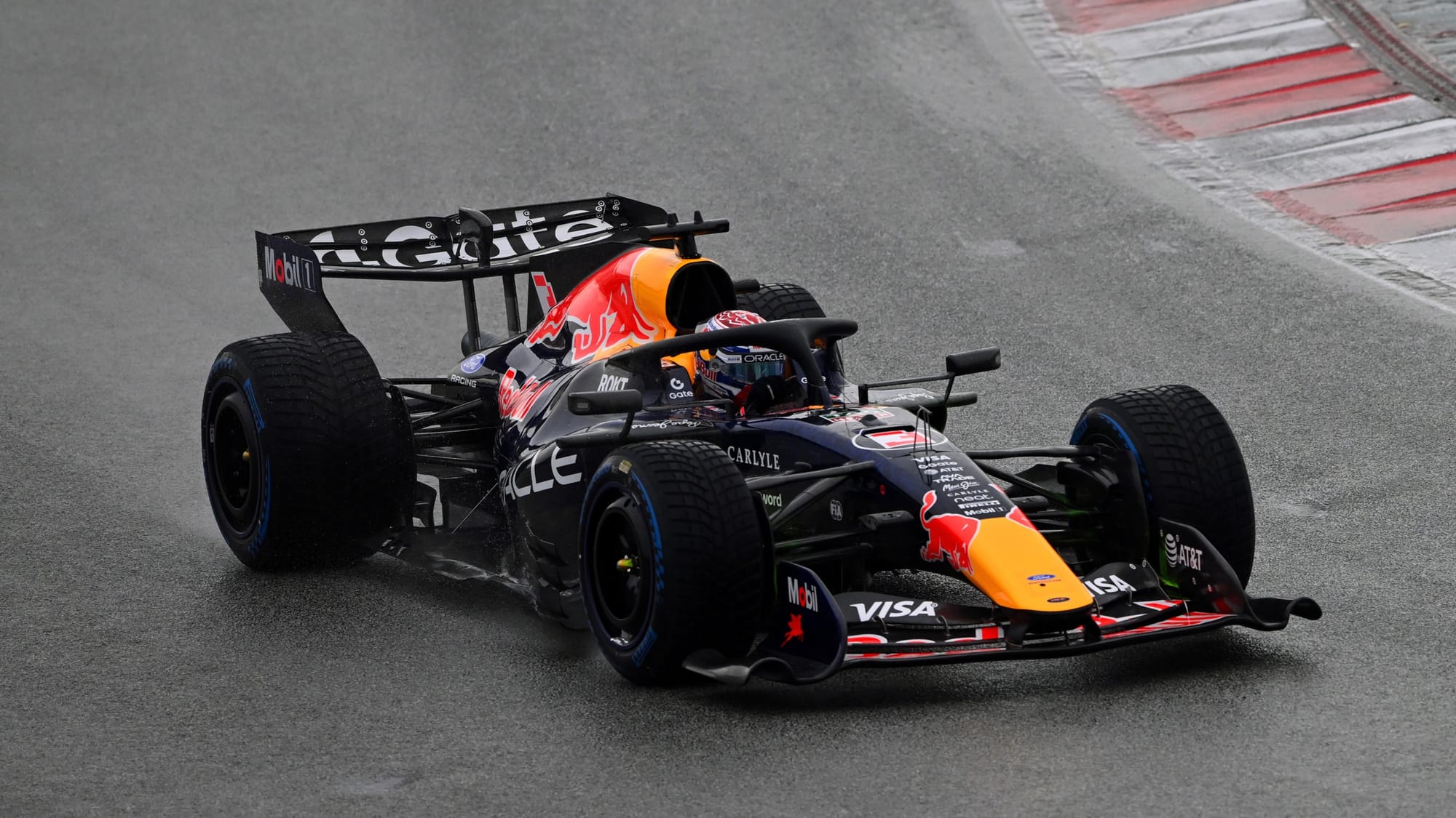
But oh no! Imperfect lighting conditions are the Kryptonite to the textural depth of this stunning design. Unless illuminated by direct bright lighting, the primary tone reads as an inky black tone, losing touch with the pleasing Ford connectivity seen in the launch visuals. Blues can often appear closer to black because, as a subtractive paint colour, it absorbs most medium and long visible wavelengths.
When the reflected light hitting the car is weak (ie on a particularly gloomy, overcast day as we saw during Barcelona testing) the luminance reaching the eye (or camera) can be very low, causing the surface to appear much darker than it is. In short, the design is strong, but the execution in real life falls short of reflecting the symbolic shift in tone that signifies this new partnership era.
5 Audi: Understated menace on a mission
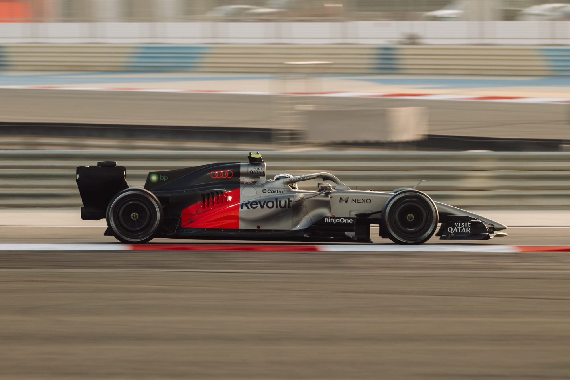
Audi has a rich heritage in motorsport, so it was always going to be interesting to see exactly where it pitched its 2026 challenger. There have been a few concepts along the way, most attention-grabbing in 2022 when it announced its intentions to join F1 as engine suppliers with an eye-catching striped Audi Sport livery that was brilliant, if entirely sponsor-unfriendly.
Skip to 2026 and the final iteration had emerged and surprised many with a stark tri-tone design dominated by a titanium tone that nods to the Germanic silver of its racing predecessors. One person's minimalism is another person's tedious; its relatively simple form may have disappointed some, but I think it makes total sense as a commercial-focused mission to represent the consumer luxury automotive brand over the Audi Sport racing division.
The geometric colour blocking is precise and anti-frenetic, differentiating itself from the more ubiquitous horizontal lines of teams including Mercedes and Racing Bulls. It's an intelligent technique to set itself apart from the pack and gives the commercial department clear, luxurious real estate to sell to prospective sponsors seeking prime visibility. There is a risk of some dilution of this vision as new partners start to clutter the cleanliness, but only time will tell how this evolves.
Audi's lava red has a fearsome vibrancy about it, a tone plucked from the fiery-hot intensity of glowing brake discs (a nice tie-in to its initial TV idents seen on the Sky Sports F1 2025 season coverage). This new red tone can be tricky to capture on camera, ranging from orange to deep red under different lighting conditions, so it will be interesting to see how it will be perceived in real-world conditions. But set against glossy blacks, the rings look so deliciously menacing that I wouldn't be surprised to see a hobbit flinging them into the nearest volcano.
The more I've seen the car on track, the more the handsome titanium tone catches my eye and the stark, bright accent stands out as being easy to identify amongst the pack.
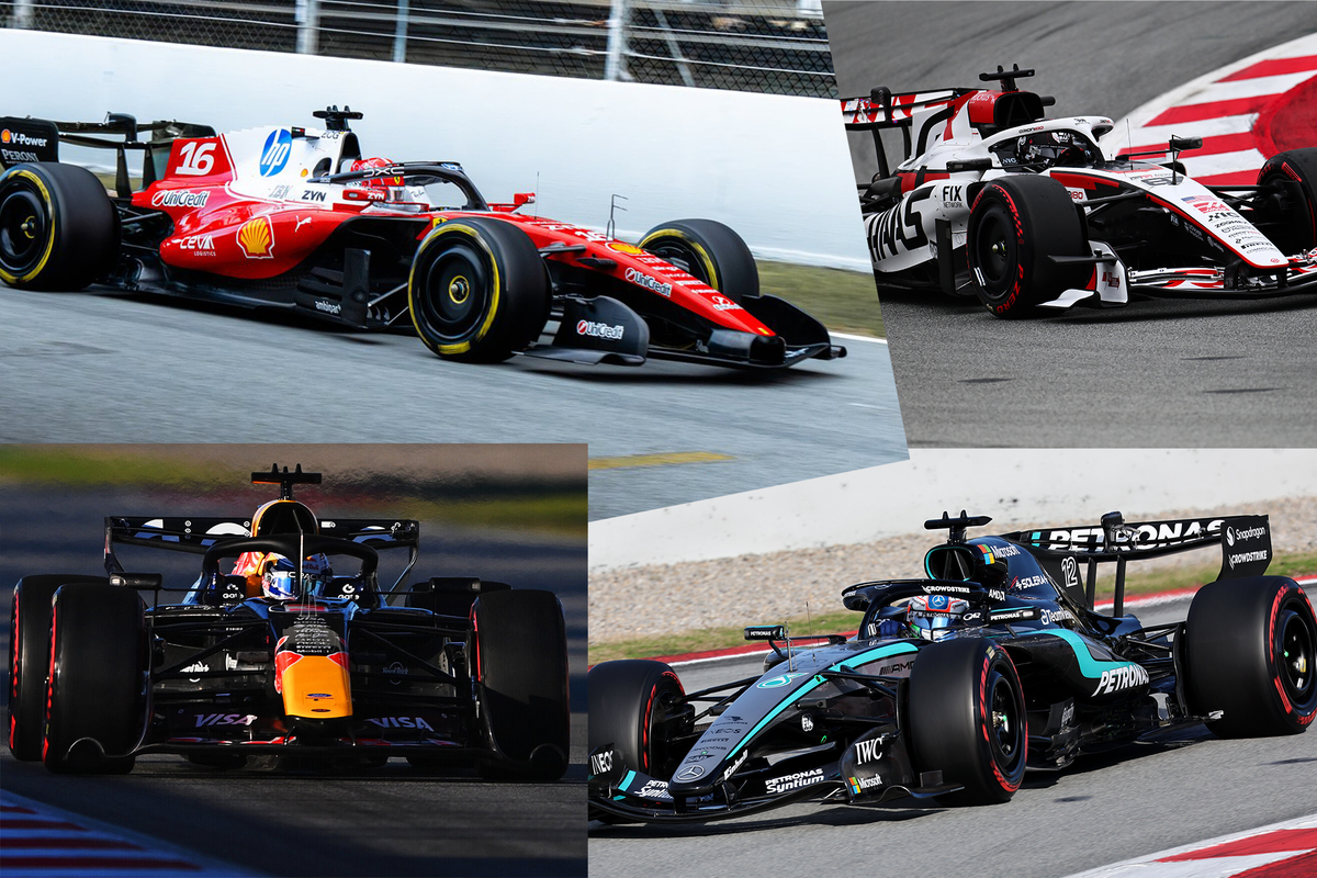
4 Ferrari: HP sorespot eases
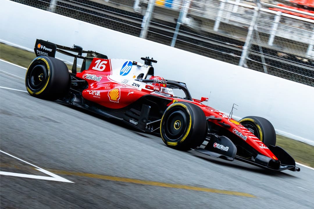
Ferrari's SF-26 livery returns to a glossy, punchier Scuderia red, that is offset with a larger white upper section (fringed with a clean pin stripe) that hugs the airbox and engine cover, eventually clipping upwards, leaving a large red expanse towards the tail for the car's gratifyingly legible driver numbers (big tick for Ferrari and all other teams using the shark fin in this way). If the pinstripe was yellow, as seen on 2024's SF-24, it could work well as a bridging accent between the white and red, but overall, this approach is a big improvement on 2025.
I would imagine that last year's Lauda-inspired livery for Monza was a useful case study for this 2026 contender. It would be ill-advised (but potentially Tifosi pleasing) to go full 1970s retro, so this is a happy midpoint. The increased white means that the dominant HP logo now has more breathing room and finally starts to look settled on the car. If there are any negatives to adding more white, it would be that with Lewis Hamilton's yellow helmet, there is a risk of the top view being "fried egg on a red plate", but this may also be a consequence of staring at these shots for too long (and skipping breakfast this morning).
Speaking of colours, having blue on a Ferrari isn't sacrilegious (see the Fiat logo on the F1-90, etc) but towards the back the rear-facing blue wing adorned with the IBM logo is still a little problematic. Blue is acceptable as an accent but works less effectively as a full panel colour; it would still be visually impactful if it was a blue IBM logo on a white background.
I'd also be tempted to apply white to the front and rear wings rather than black, which is less complementary to the blue and white HP logos. The black tones ground the car, but bringing in more white could potentially tie the concept together more effectively from nose to tail.
3 Racing Bulls: Big brother botherer
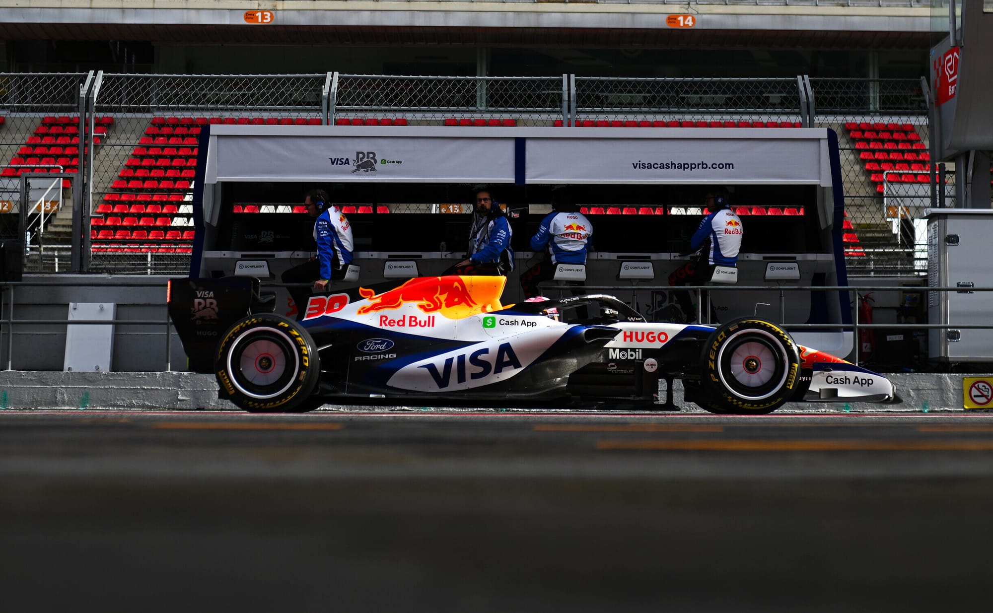
Red Bull may have made a big statement this year, but the sister team has built on its crowd-pleasing 2025 livery to deliver a look that has stayed true to its established identity for 2026.
Racing Bulls retains its predominantly white base that, similar to Haas, is enhanced by sleek detailing accented elements that hug the form of the bodywork, giving the effect of a raked, lean machine.
There are a lot of challenging elements for a designer to contend with (integrating sponsors' red, green, yellow, blue, white and black accents for a start). Gone are the mini bulls from the engine cover (which helps to declutter and is no great loss) and in its place is a more Ford-friendly panel. From its side profile, you’d be forgiven for thinking the contrasting blue and white cross points are a nod to veteran Red Bull driver David Coulthard's Saltire-inspired helmet, but overall Racing Bulls has delivered a livery that is greater than the sum of its many parts.
The Toro Rosso-era designs are still the brand's high watermark, and I think it still feels like this could be a Red Bull one-off special rather than its own defined character, but that in itself is still praise. In fact, it is one of the most handsome liveries this year, steals the spotlight of its big brother, and features potentially my favourite graphic detail in the form of the excellent chunky red driver numbers on the engine cover.
2 Mercedes: Sending shockwaves
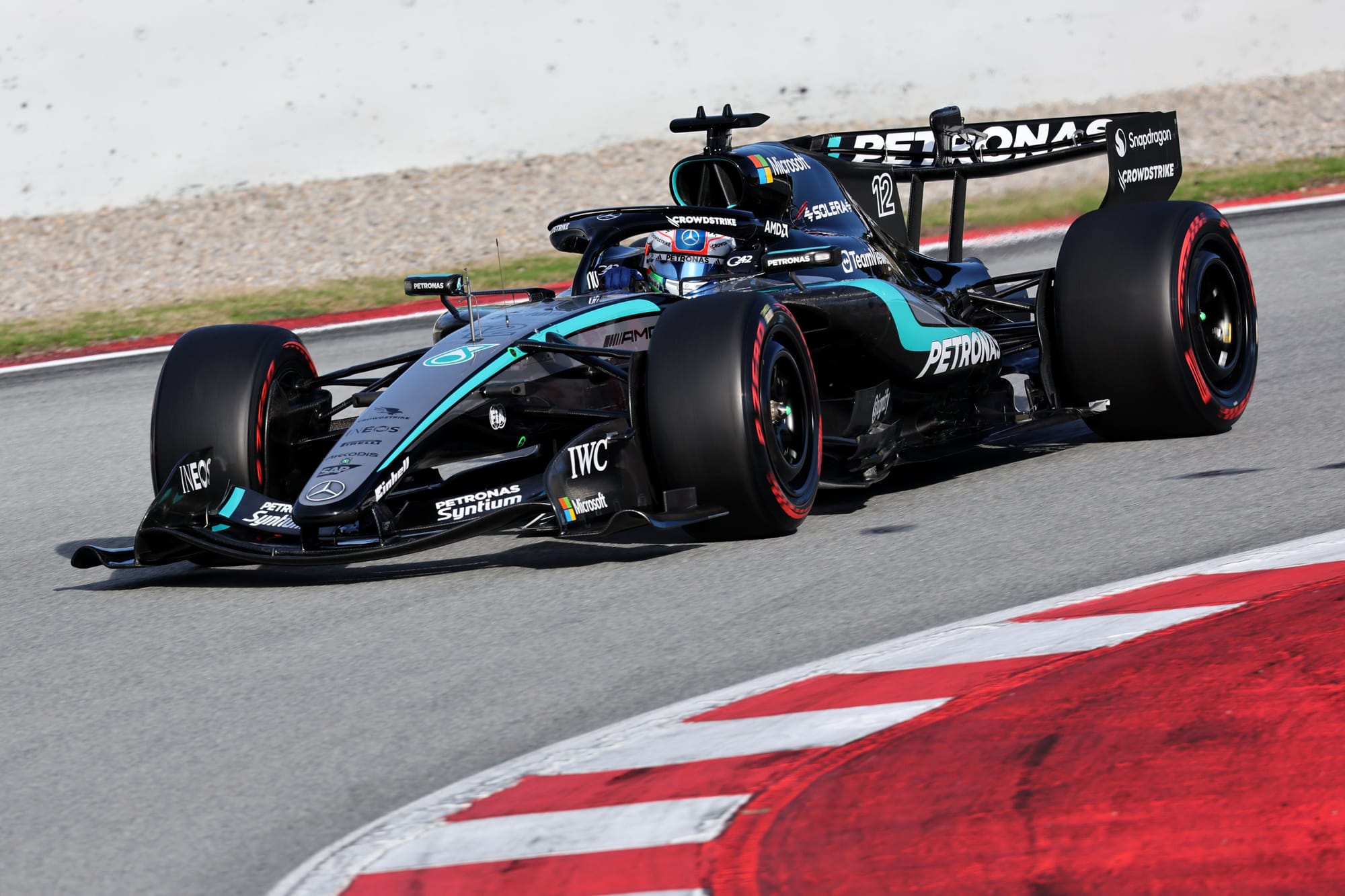
From the front view, this feels very much like the well-executed 2025 concept. But as we scan down the car, the clean silver lines disrupt into a new shockwave graphic that ripples off into a black foundation, finished with the familiar Mercedes-Benz star pattern. It's busy, with a few different concepts brought together, but pulls off an eye-catching package.
The star motif has become a set feature of recent Mercedes liveries, something we're now increasingly seeing across the radiator grilles of Mercedes' EV range, which is a nice tie-in from a consumer perspective. I am drawn most to the bird's-eye view as the most aesthetically pleasing, and I think it's primarily because it features the most silver and shows the shockwave concept at its best. These new stripes seem to have caused confusion among fans; are they Adidas stripes? Are they AMG fins? This means the livery is provoking the right questions for the brands paying big money for presence on the car.
Speaking of which, Microsoft now has prominence on either side of the air intake and the front wings. This means Mercedes has lost some of its silver gradient on top of the car as the black has been increased to assist with sponsor visibility, but considering it integrates the tech company's full colour window icon, I've seen clunkier integrations down the grid.
Whenever I have seen the car on track or in the pits, the overwhelming effect is one of the car being unlike anything else on the grid. It appears to be in constant motion even when it's static and the visual impact is one of the strongest for 2026.
1 Haas: GRrrrreat!
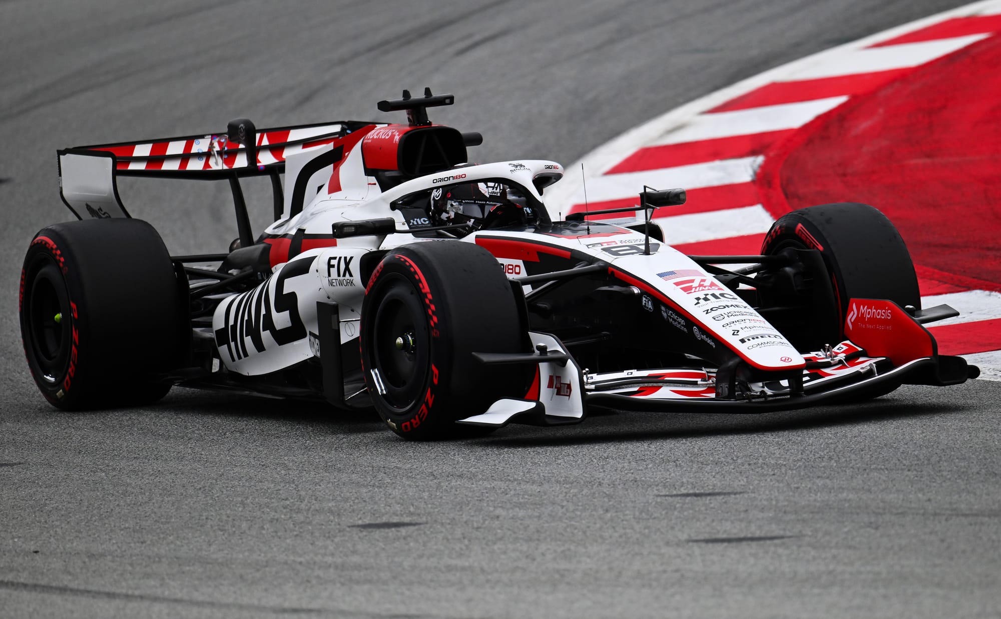
Historically, Haas liveries never steal the spotlight, but in recent years, the designer has consistently delivered nose-to-tail concepts that feel well considered and balanced.
In its 11th year, Haas has taken a step forward to create an elegant modern classic that reminds me of what BAR Honda did so brilliantly in the mid-2000s. Haas have played to the strengths of the new body shapes and everything works in blissful harmony. It's minimal without being undercooked and dynamic enough without being over designed, laced with select swooping and diving graphic elements that are characterful and sponsor-friendly.
The most notable brand placement comes in the form of Toyota's motorsport division Gazoo Racing's GR, which utilises the shark fin and works with the flow of the car, rather than being at odds with it like other title sponsors. The negative tracking of the GR typography see the letters overlap, but it is still recognisable from its extracted source. It shows the power of a brand willing to be flexible enough with the representation of its identity to complement the livery.
If I had one tiny tweak I'd like to explore it would be to give some of the red elements a little frayed edging in line with Toyota's other race liveries across the World Endurance Championship, World Rally Championship and its previous time in F1, but that isn't anything to take away from the great job Haas has done this year.
It feels like a genuine partnership, not a contractual obligation, and many other sponsors could learn from this flexible approach to brand representation to create a more positive sentiment for fans.