The stars and flops among F1 2024 liveries - A designer's view
We've tasked The Race's Creative Lead Oliver Card with casting his design eye over the 2024 liveries produced by the 10 F1 teams.
"This year, you only get to paint 50% of the car because we need to save weight," livery designers are told. "And make it look good, obviously. Good luck!”
It’s a tough time of year for F1 livery designers, as an onslaught of armchair experts express their displeasure with each car reveal.
The complexity of livery design is so multifaceted, think of the size of an organisation like global credit card giant, Visa, stepping into its first new global sports sponsorship agreement in 15 years with RB (or Visa Cash App RB to give it its full title).
Visa will want to fiercely guard the representation of its identity across the world, meaning the livery will have to be approved by a densely layered chain of command - and sit elegantly alongside other global brands such as Honda, Hugo and Orlen, all with their own strict brand guidelines.
The presence of carbon fibre has dominated this year’s liveries and a cursory glance across social media shows it’s gone down particularly badly with the fans.
So who has created a future classic, and who has missed the mark with their 2024 livery?
McLaren - Stripped Back Too Far
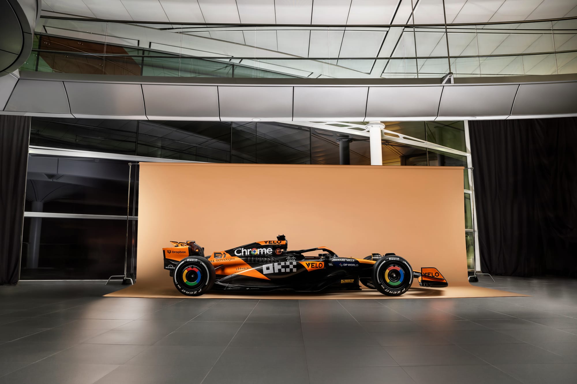
Since the return of papaya to the car in 2018 (sorry orange 2017, you really did miss the mark), McLaren has methodically peeled away orange slices year on year, resulting in the MCL38, which now feels like a black car with orange accents.
As a result, in places, the payaya (which has been subtly tweaked for this year) ends up feeling like a sequence of very separate stickers which gives the livery a disjointed feel, particularly towards the mid-section of the car.
As a team, its design work off-track across social and merchandising has been exceptional and over in IndyCar, McLaren has been showcasing some of the best modern-era McLaren liveries, suitably heritage-nodding without looking stuck in the past.
By revealing more carbon fibre, the new F1 car feels a bit naked and half-complete by comparison.
However McLaren earns bonus points for its chrome F1 driver numbers which are a beautiful touch. I just pray they don’t get swapped out in the name of weight-saving come Bahrain.
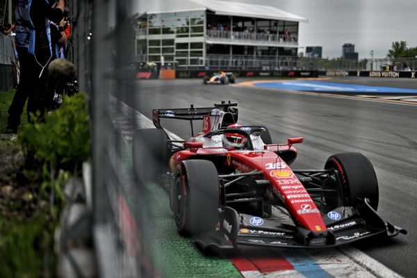
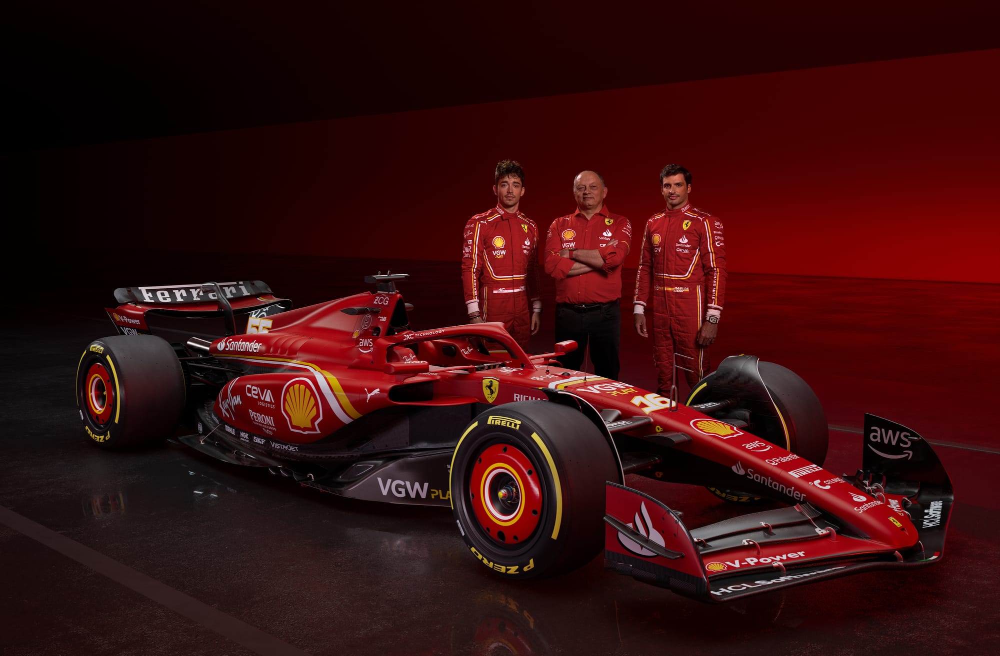
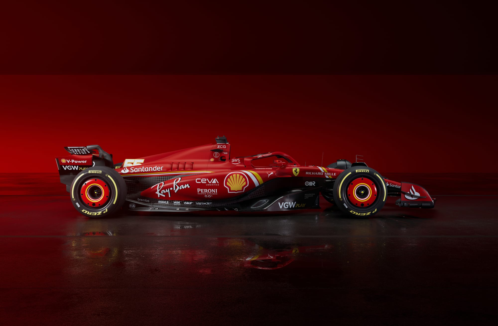
Ferrari - Uncompromised classic with a twist
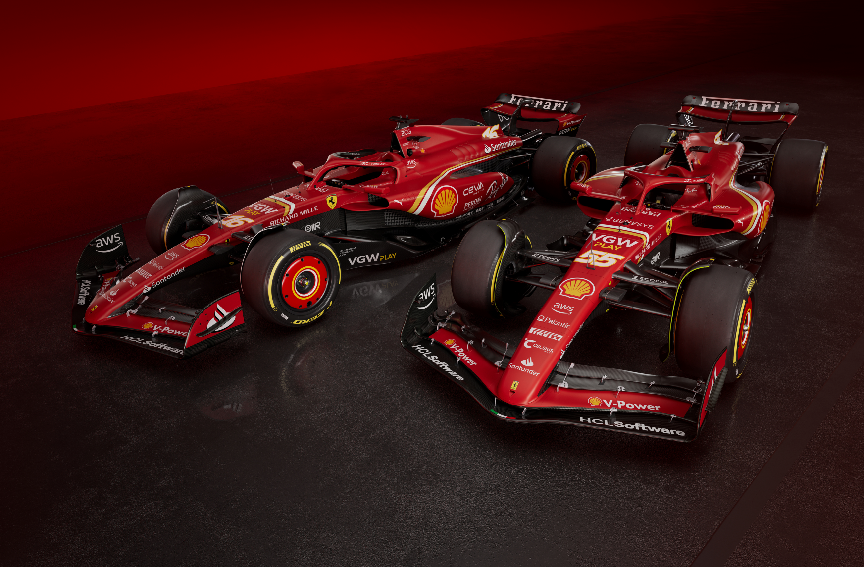
The SF-24 has one of the stronger 2024 liveries; appropriately modern but still undeniably Ferrari. It is a concept which sees the car liberated with red throughout, proudly uncompromised compared to the rest of the field.
A great example of this can be found on the front and rear wings, now split into alternating reds and blacks (gasp, Ferrari actually ADDED colour) which sees the iconic rosso corsa extending throughout the bodywork. Molto Maranello.
The introduction of the dual white and yellow pinstripes is a lovely addition this year, a racing motif which extends all across the entire car right through to the driver suits, complementing their yellow accented sponsors and the driver’s nationality flag colours.
In terms of a visual metaphor, this addition shows a team that has a unified, connective thread between the car, the drivers and beyond.
When it comes to carbon fibre, the visible panels have been adjusted to be less disruptive than it was last year. This is particularly noticeable on the sidepod section from last year’s SF-23 (where the CEVA logo sat in 2023) which has been repositioned to the upper section of the sidepod, allowing a larger, cleaner body of red in its side profile.
My only criticism of the SF-24 is to do with the sponsor logo placement. It’s very bottom-heavy and the sidepods are particularly crowded. Opportunities lie in the upper engine cover, which is currently quite blank. Shifting one of the lower brands up into this space would give all sponsors more breathing space.
RB - Better than the name suggests
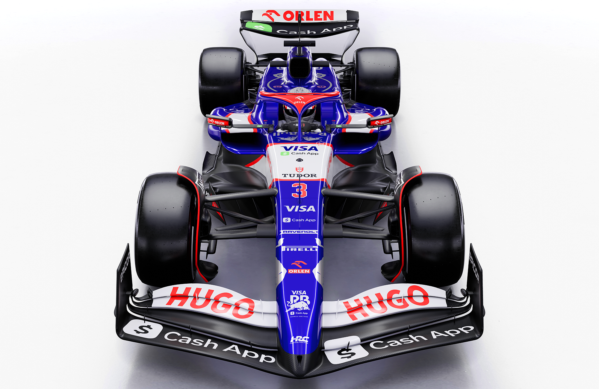
Leaving aside the controversial name, this was one of the liveries I was actually most intrigued about for 2024. When the Visa partnership was announced, the idea of a vibrant cobalt blue car with silver detailing (reflecting Visa’s brand colours) became quite an alluring prospect.
The result is a 2024 livery that has been cleverly rooted in a crowd-pleasing 2017 Toro Rosso (which was a particularly pretty era for the Red Bull junior team) but revised and updated for the new title sponsor.
The initial renders showed heavy-handed thick red lines dividing the white from the blue, but seeing the coverage of its shakedown, it appears these have already been reduced and refined for the real-world iteration and as a result, is much better for it.
The eye-catching silver and blue glossy combination will set this car apart from most, but I feel there is potentially a little conflict between the white/red of the Hugo-Honda-Orlen and the blue/silver of Visa itself.
This isn’t helped by the clashing direction of the diagonal white nose stripe and the dead-horizontal engine cover strip, which I feel could have been aligned better to make the livery feel more cohesive rather than as two separate sections.
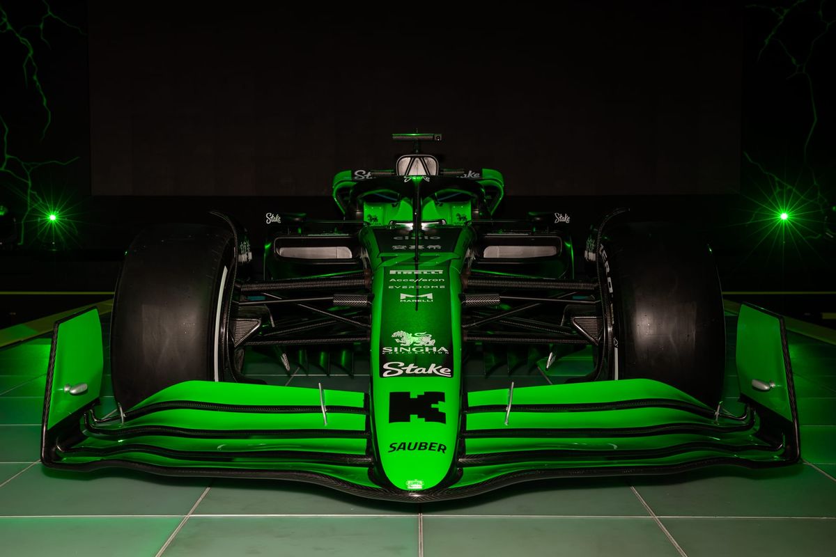
Sauber - Unmissable, but a missed opportunity?
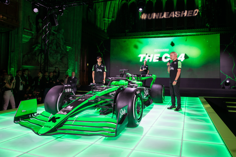
Once I got over the “darts player-chic” team kits (an unintentional homage to another Dutch sporting star, Michael van Gerwen) the newly rebranded Sauber car was revealed.
Green was teased… green was delivered. And what a green it is! My first instinct was “so that’s what a Kawasaki F1 team would look like” but the good news for Stake (sometimes Kick, still Sauber) is that it will be easy to pick out in the crowd and beautiful pinging under floodlit races. However, capturing the neon consistently will be a challenge for photographers and camera operators alike.
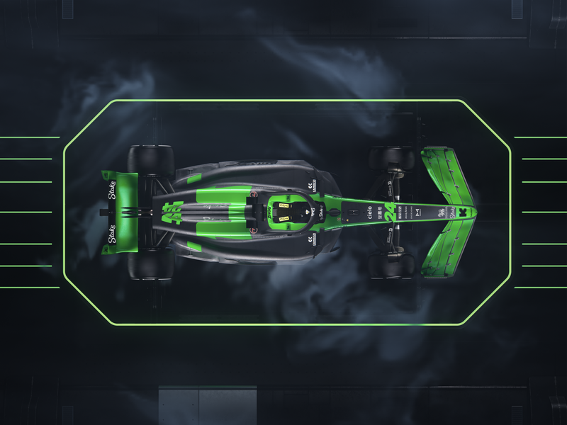
What is unfortunate for me is the missed opportunity to make this a proper lean, green racing machine that could have made a big brand statement like that of The Race’s perennial favourite, the Jordan 191.
Sauber doesn't have long before Audi comes in to scoop up the team in 2026, so for this short chapter why not take more of a risk? But as we’ve seen with the roster of 2024 F1 cars, these are sadly not those times.
Alpine - Allez les.... noir?
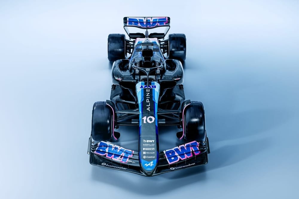
Alpine collaborated with Argentinian-Spanish artist Felipe Pantone on the design of the A524, but there’s a feeling that he wasn’t quite given all the keys to the sweet shop.
For the paint that's actually there, the designer has integrated some lovely layered detailing. The bird's eye view of the car really expresses this with multi-tonal pinks and blues.
But this is a largely black livery that lacks enough of the all-important blue Alpine accent.
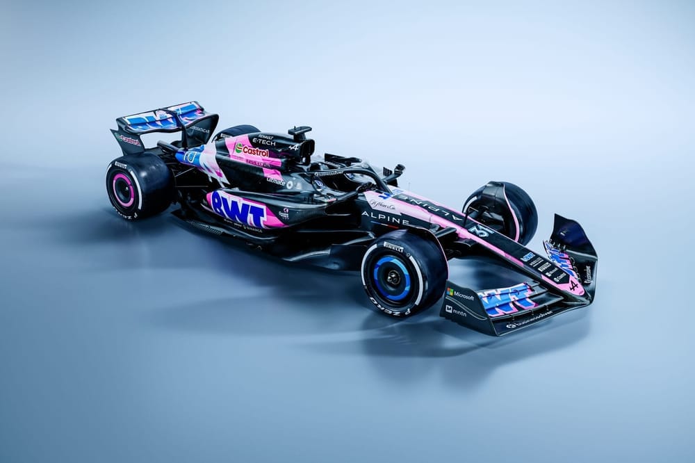
Even the pink edition (above), usually a highlight of the Enstone team’s special edition liveries, is a muted affair that is not distinguishable enough to be notable. A particularly hurtful gesture was the team teasing an all-pink camo front wing on social media, only to fail in their delivery of this promise.
Another teaser won’t hurt 😉 pic.twitter.com/NLbxOau894
— BWT Alpine F1 Team (@AlpineF1Team) February 6, 2024
In blockbuster movie terms, Alpine went full Oppenheimer, when it should have gone more Barbie.
Williams - Grown Up from Grove
After an era of less than appealing Williams’ liveries, the last few years have seen significant improvements and this year builds on last year successfully.
Is it damning with faint praise to say it looks a bit… grown up? Mature, maybe. It’s a darker, more serious tone of blue, executive and business-like. There’s a risk it might be a little too murky under poor lighting conditions but it's hard to judge without seeing the car on track.
If nothing else, it's reassuring to see Williams attract sponsor names back to the car, and I am interested to see if it will replicate its 2023 Gulf Fan Livery Vote which proved to be a successful and fan-pleasing campaign.
Speaking of fan favourites, the Duracell airbox, one of modern F1’s great brand integrations, thankfully remains untouched.
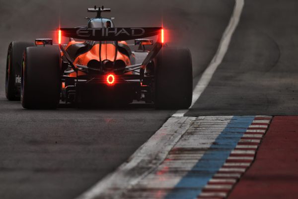
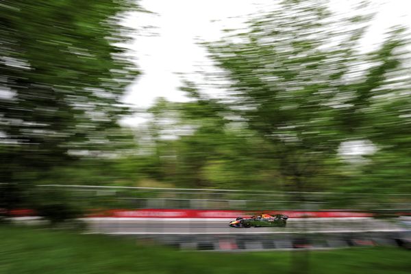
Red Bull - As you were
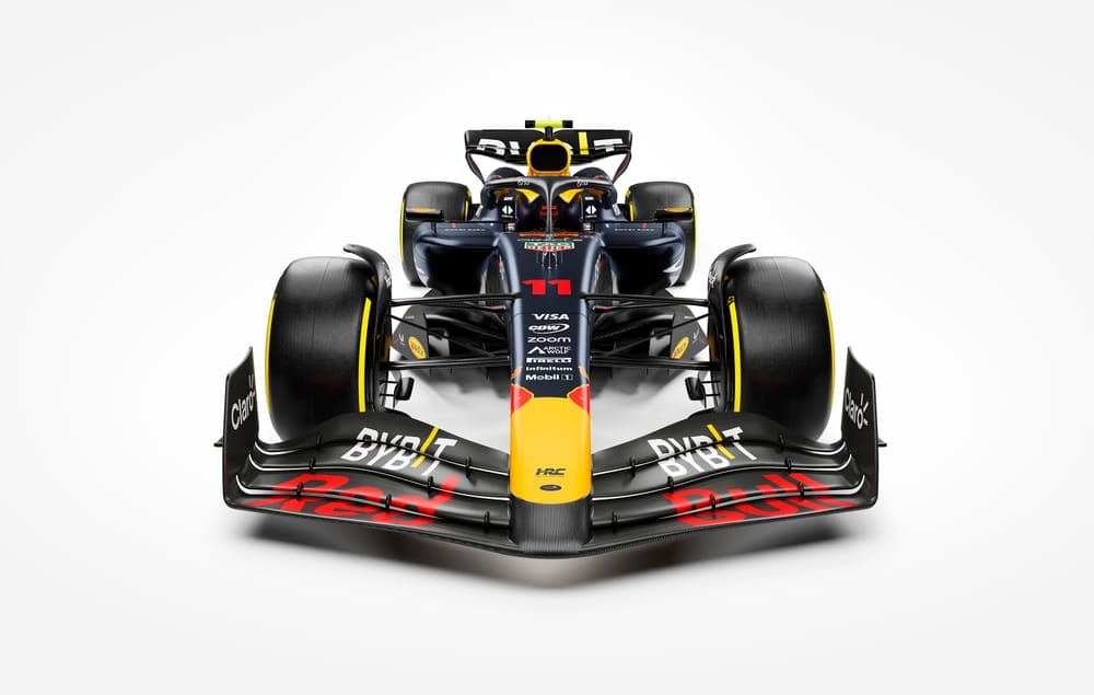
This is the 20th Red Bull Racing car to grace the grid and it's delivered an unsurprising continuation of its livery which has remained largely unchanged since 2016.
A marginally repositioned bull on the spine of the car is a small change introduced for this year. It’s subtle but gives the appearance of the bull facing forwards rather than down. Beyond that, I’m struggling to see any differences that will set the hearts of fans racing.
This is undoubtedly a modern classic for F1 liveries. I liked this generation of Red Bull livery when it was introduced on the RB12 as it felt so refined. As masters of marketing, Red Bull is a brand synonymous with grabbing people’s attention with ingenuity, spectacle and the extreme.
Does eight years of the same look align with the values of this historically revolutionary brand?
As we know, liveries don’t win races, but Red Bull certainly does. Energy is clearly being spent elsewhere to ensure the car stays at the front of the pack.
Aston Martin - Uncontroversial Continuity
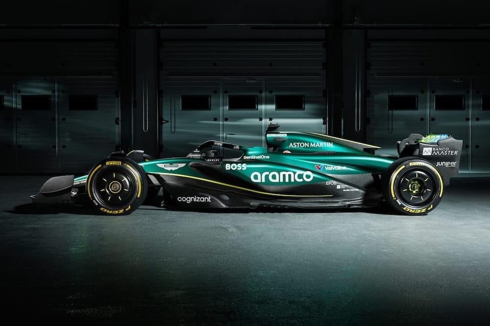
Aston Martin was quite tactical in its initial render selection for showcasing the AMR24, angling the virtual cameras just enough to evade revealing swathes of carbon fibre over the sidepods. But yes, peek closer - or glance at the shakedown images - and there is more carbon coverage than before, disconnecting the green into several sections.
For the paintwork, after a bit of trial and error with nailing the right green over recent years, Aston Martin has sensibly stuck to the formula for 2024, so there is not much to report in the department (if it ain’t broke…etc.).
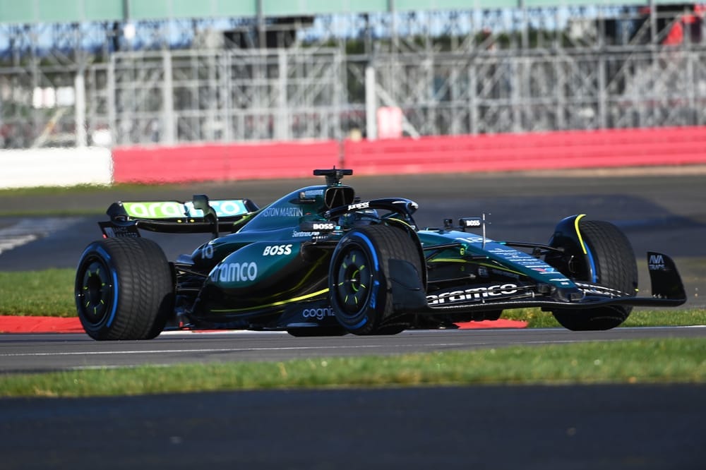
Thankfully the ratio of carbon fibre just about tips the scales towards more colour than not. Chartreuse and Racing Green have been a winning combination for Aston Martin Racing historically, but does stripping it back for the F1 car remove the DNA that could finally lead them to the top step this year?
Haas - Evolution not Revolution
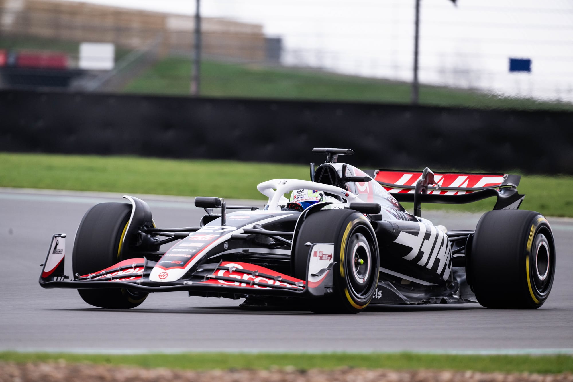
Haas is in an advantageous position whereby large areas of black have always been quite dominant on its recent liveries.
A continuity of title sponsors has seen subtle rather than revolutionary changes and the VF-24 builds on last year’s livery, with red and white accents as before. Title sponsor MoneyGram has always sat well on this car, and this year is no exception. It is not a revolutionary redesign, but it does not need to be.
Flipping the nose accent to black from white feels like a good decision and the red pinstripe detail is more refined than before. Improvements have also been made to make the large Haas logo more dynamic, which now appears to grow out of the sidepods.
An area of improvement for me is around the driver numbers on the nose that get lost amongst sponsors. This lack of legibility will not help fans differentiate the cars so easily, but this is a wider problem for a lot of other teams as well.
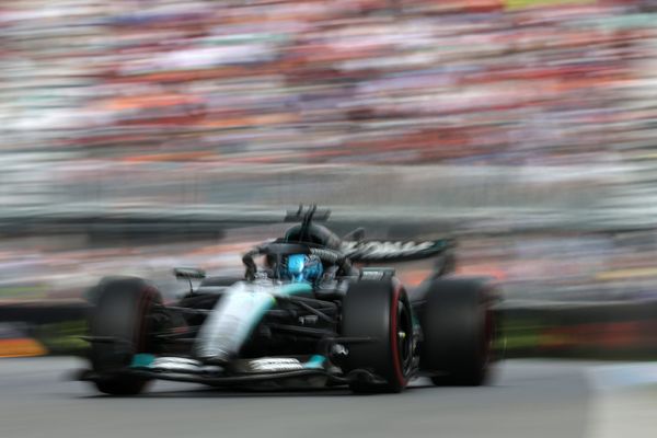
Mercedes - The Greatest Hits Tour
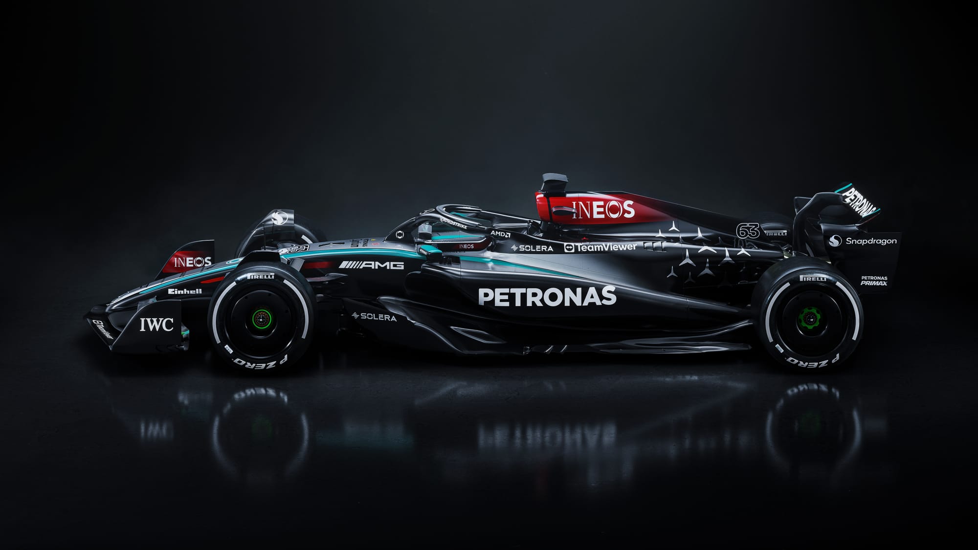
There is quite a lot going on here, but there is one very clear message with this design. The gradient from silver to black is a way for the team to represent the blending of eras, indicative of the team’s intention to return to a more dominant form and get back to the top step.
The look of the W15 delves deep into the Mercedes back catalogue for this Greatest Hits tour, going as far back as the 2005 McLaren Mercedes MP4-20 for visual inspiration.
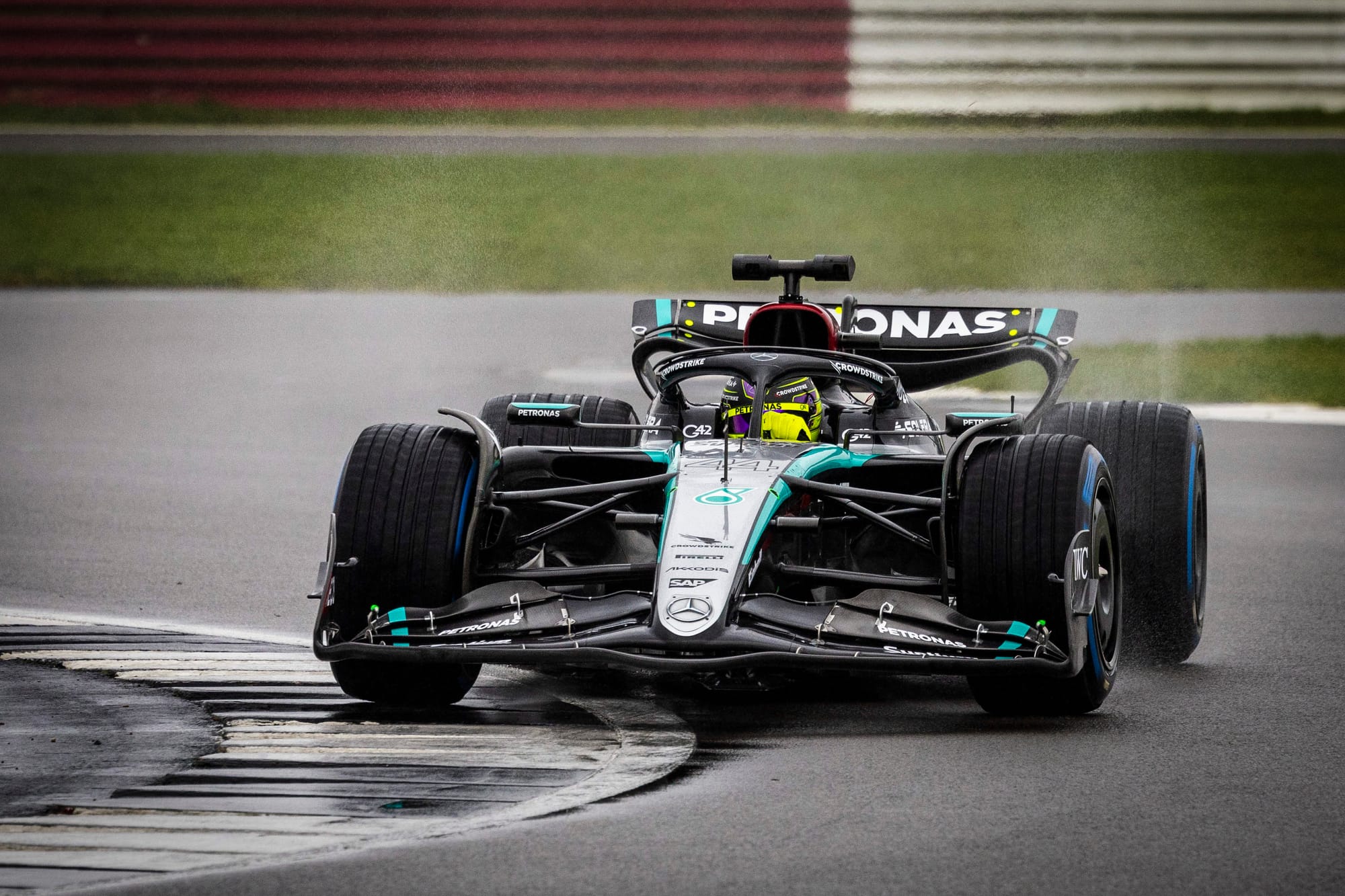
Its strongest viewpoint is straight on where you can really appreciate the elegance of the vision and all its cohesive elements. This is where you see the true Silver Arrow. Raising and expanding the punchy Petronas green racing stripe to the top of the nose gives a more pleasing aerodynamic arch. The front view also minimises the impact of the red, which now extends further down the spine of the car. When the INEOS red was introduced in 2020, I felt like it was one element too many and this year’s increased coverage doesn’t help in this regard.
I loved last year’s clearly defined driver numbers, but sadly these have been sacrificed and lost their colour accents (a sensible decision to avoid the blue/neon clashing with the new Petronas green nose stripe) but as a result, will now be much less easily read.
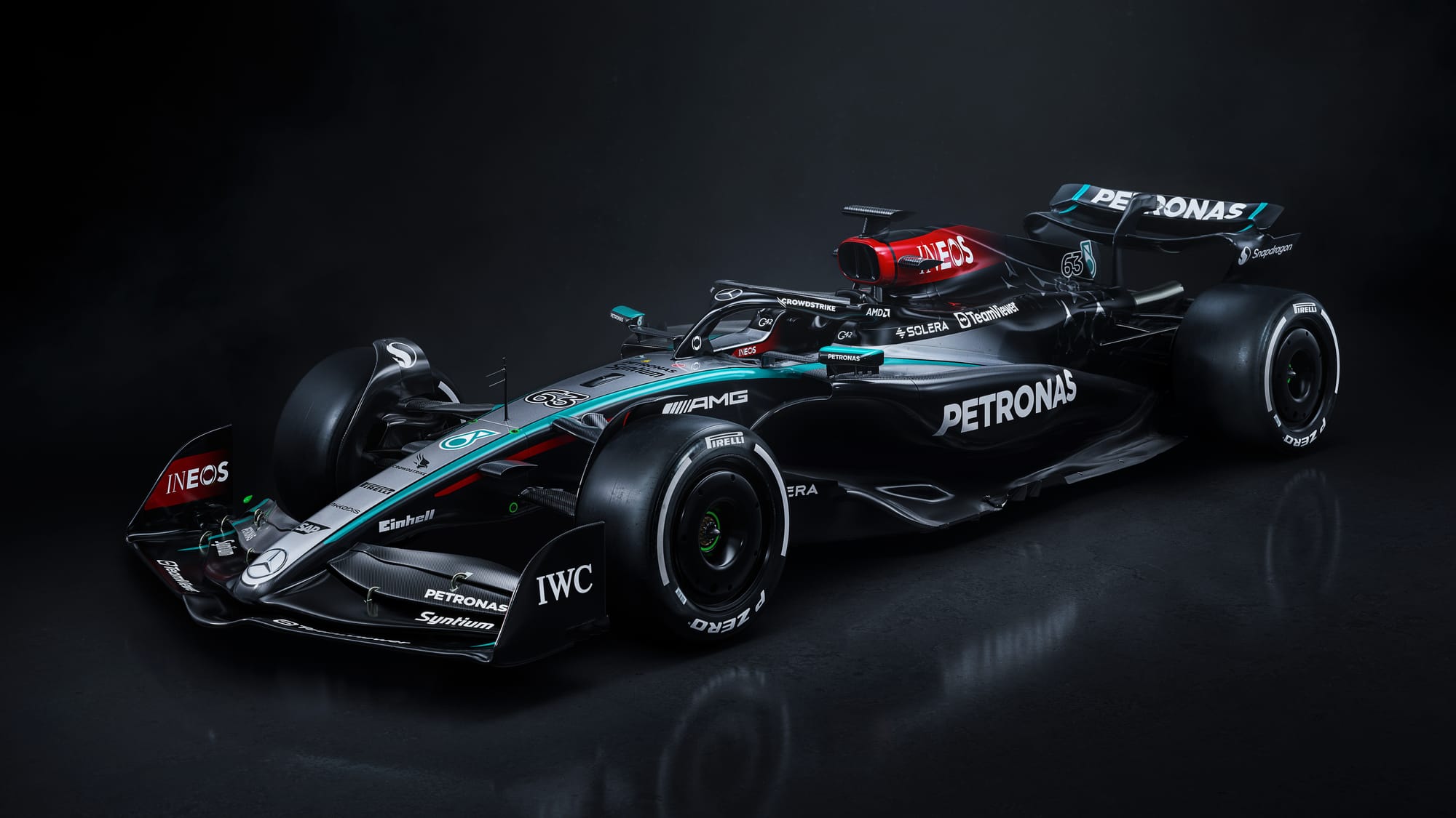
Towards the mid-section, I also would have liked the silver gradient on the engine cover to feel more organic, rather than the hard clipping edge, but this will be a decision driven to allow greater sponsor visibility. The Mercedes star motif towards the rear has been present since 2019, but this larger scale competes visually with the rest of the car. Reducing or varying the scale would give a more natural feel so they appear less disruptive to the revised front nose section.